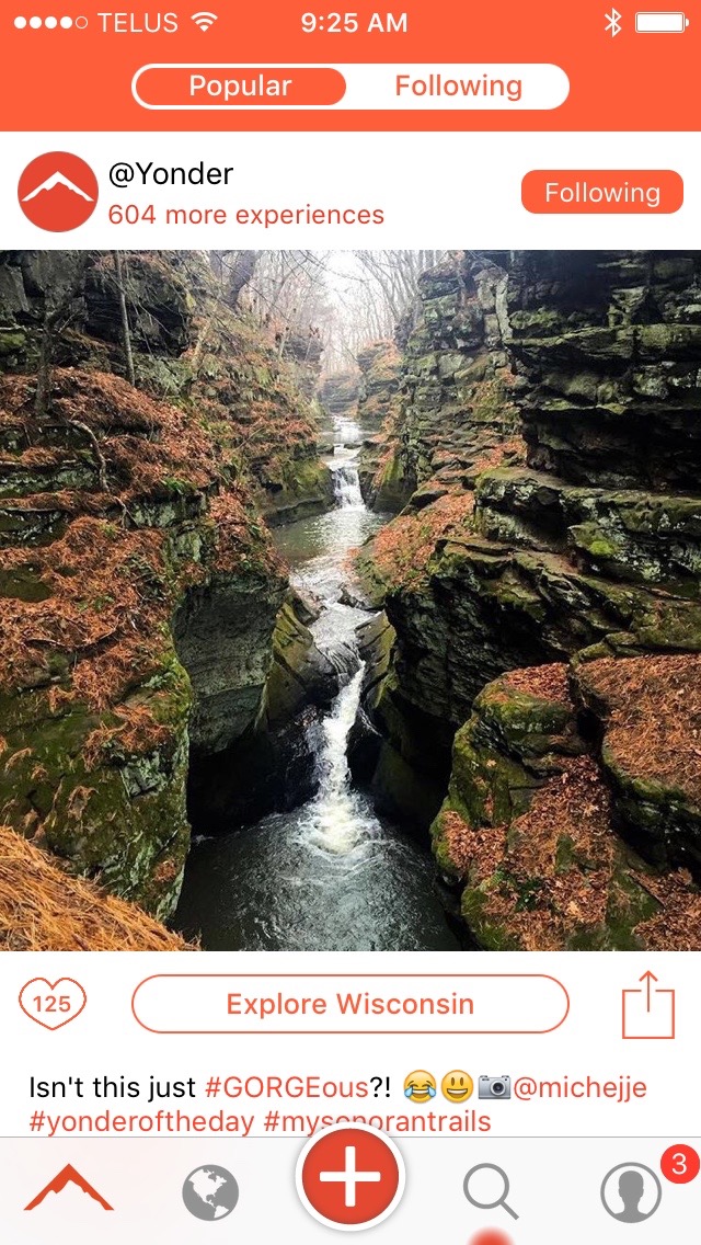
Yonder 3.6 Is A Pretty Big Update!

Yonder just realized version 3.6 of their awesome outdoors photo sharing app. Not only is it a lot more orange, but it's easier to like photos and explore new areas that catch you eye. Interestingly, they tease that these new changes help set up future versions coming in 2016! Here are the release notes...
- An all-new, bold look for the feed. The venerable, dependable Yonder feed has been with us since the beginning, but we thought that it was time for something new. Something with style and flair. Something that puts all of your beautiful outdoor experiences on full display. Something that highlights the awesome, hilarious personality of our Yonder community. Something with double-tap-to-like (!!!). And, well, something that's orange! We packed all of that and more into Yonder’s new feed - open the app now to check it out!
- A brand new way to Explore the outdoors. Have you ever checked out someone’s experience in Yonder and thought, “gee, I wonder what else was going on around here?” Well, wonder no more - just tap Explore! There’s now a big “Explore” button underneath every experience in the new feed - tap it to learn more about the destinations and experiences that surround that experience!
- URLs in the main feed. Got a link that provides some killer context to your experience? Maybe a key piece of gear that made the whole thing possible? Or just a hilarious gif? Well, paste it right in: links are now able to be opened from the main feed!
- And, of course, a whole bunch of small improvements and bug fixes: the ability to copy a sharable URL for an experience right from the main feed, smaller app download size, improved search history (no more dupe’s), and more!
Be sure to download Yonder (available for both iOS and Android) and share your outdoors adventures. Stay connected with Yonder by following them on Facebook and Twitter.
Evan Holt


